Building Bones was founded by Jenni, a senior physiotherapist with an MSc in Digital Health from UCL — and a personal reason to build it. When her own mother was diagnosed with osteoporosis, Jenni worked with her to rebuild bone density and lower her fracture risk, and saw first-hand how much the right programme could change. The harder problem was everyone else: bone-health care is fragmented, specialist help is hard to reach, and most people simply don't know where to begin — or can't find a programme they'll actually stick with. Building Bones is her answer: one place that makes osteoporosis and osteopenia care reliable, accessible, and easy to keep up with. I designed the whole product — the app itself and the physiotherapist's admin behind it. I was the only designer on it, but not working alone — I stayed in a constant loop with the PM on what was buildable and where the limits were, so the product I handed over was one that could actually be made.
01
The problem
Osteoporosis is manageable — it's the care around it that isn't.
Osteoporosis and osteopenia aren't a dead end: the right exercise and habits genuinely rebuild bone density and lower fracture risk. But working with patients across Ireland and the UK, Jenni kept hitting the same wall — the care around it is fragmented. A diagnosis in one place, a scan in another, a rushed referral to a physio you might wait months to see. Nothing joins up.
So people are left to work it out alone. Trustworthy advice is hard to find, specialist help is hard to reach and expensive, and even a decent plan is usually generic — and quietly abandoned within weeks. Most never get past "where do I even start?"
Building Bones had to close that whole gap at once: put expert, personalised bone-health care in one place, make it genuinely easy to reach, and — the hardest part for an older, cautious audience — make it something people actually keep doing.
02
Who I'm designing for
Every decision on this project bends around one person.
Before structure or screens, I got specific about who this is really for: a recently-diagnosed older adult — cautious, not especially tech-fluent, and quietly afraid of a fall that could cost her independence. Meet Margaret. Almost everything that follows — the trust-building onboarding, the physio on video, the big calm UI, the plain progress in the tracker — traces straight back to her.
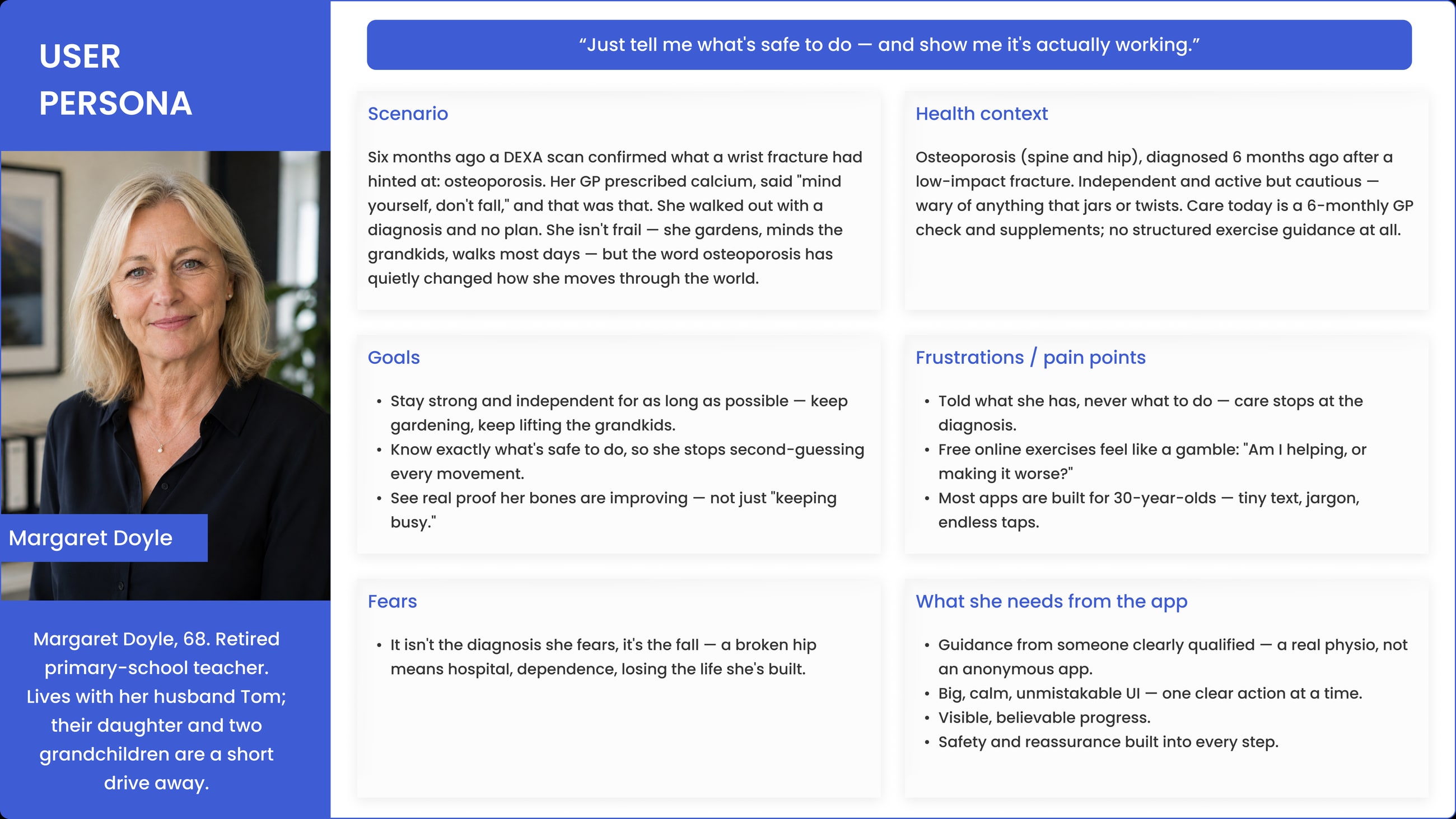
Margaret Doyle — the primary user · tap to open full size ↗
03
The sitemap
Before a single screen, the whole app on one page.
Before designing anything, I mapped the entire product as a sitemap — every screen, and how they connect. It starts at Login → Home, then branches into the five places a user ever needs to be: Profile, Exercise, Tracker, Education and Community. Everything else hangs off those.
For an older audience, this step does the heavy lifting. Settling the hierarchy up front is how you keep the app shallow — anything that matters is a tap or two from home, and nothing important gets buried. It's also where I made the programme and the tracker mirror each other — both branch into Strength, Balance and Impact — so the two halves of the app always line up. By the time I opened a screen, it already had a clear place to live.
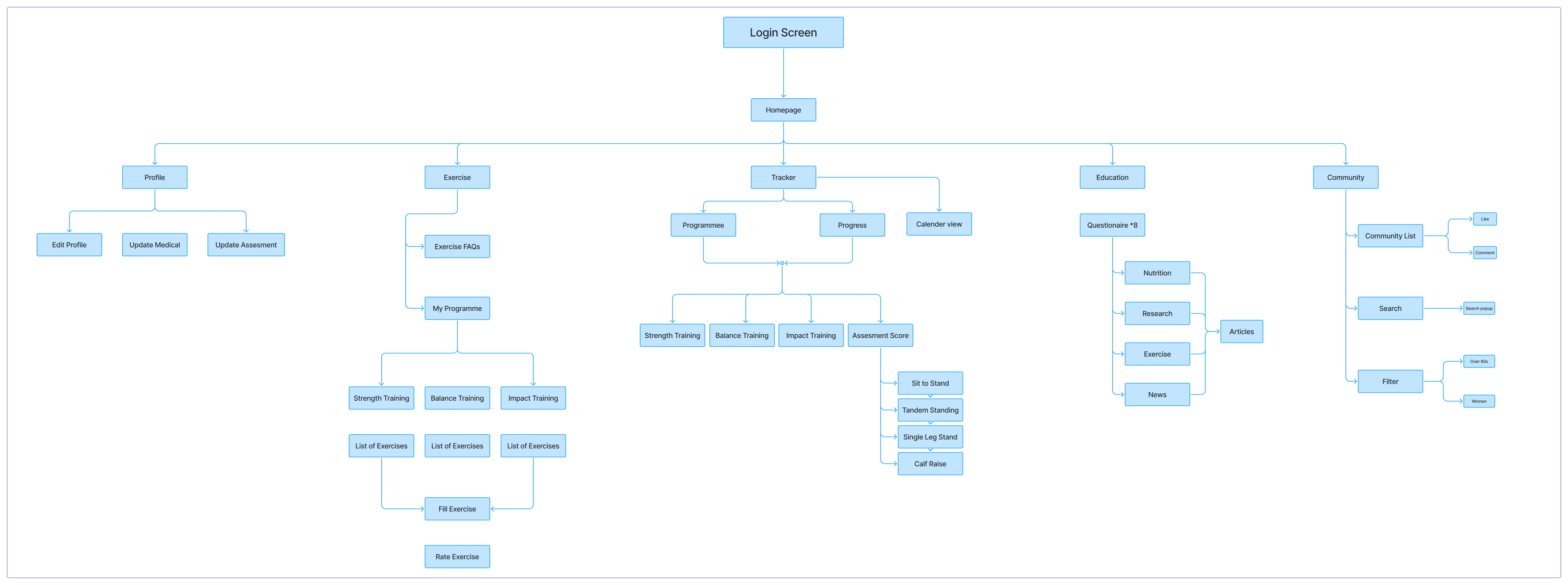
The whole app, mapped before design began — tap to open full size ↗
04
Design system
A deliberately small palette, and a typeface chosen to be read — not admired.
With an older, cautious audience, restraint is the design. The palette is intentionally tiny — a brand blue, a deep navy for actions, white, and near-black text. Because every button is that same deep navy, the "tap here" cue never changes: one colour, one meaning. No colour-guessing, no visual noise, nothing competing for a nervous first-time user's attention.
Colour
Typography
Poppins
Regular · Medium · SemiBold · Bold
Why Poppins? A geometric sans with round, open counters and a tall x-height, so it stays clear at the large sizes older eyes need. Its soft, near-circular shapes read as friendly and calm rather than clinical — the opposite of the cold, medical tone that puts this audience off. Legible first, warm second: for a nervous user reading with their glasses on, that's the right order.
05
Onboarding
The app earns trust before it asks for it.
It opens with a thorough medical questionnaire — around 23 steps — asked one question at a time. Medical history, current condition, mobility, lifestyle: the depth a physiotherapist needs to build a programme that's genuinely safe for that specific person, never a generic plan.
Asking one thing at a time does two jobs. It keeps a long intake from ever feeling like a wall of forms — and it quietly signals care. The app is taking the time to understand you before it prescribes anything, and for people who've been let down by rushed, fragmented care, that patience is where trust starts.
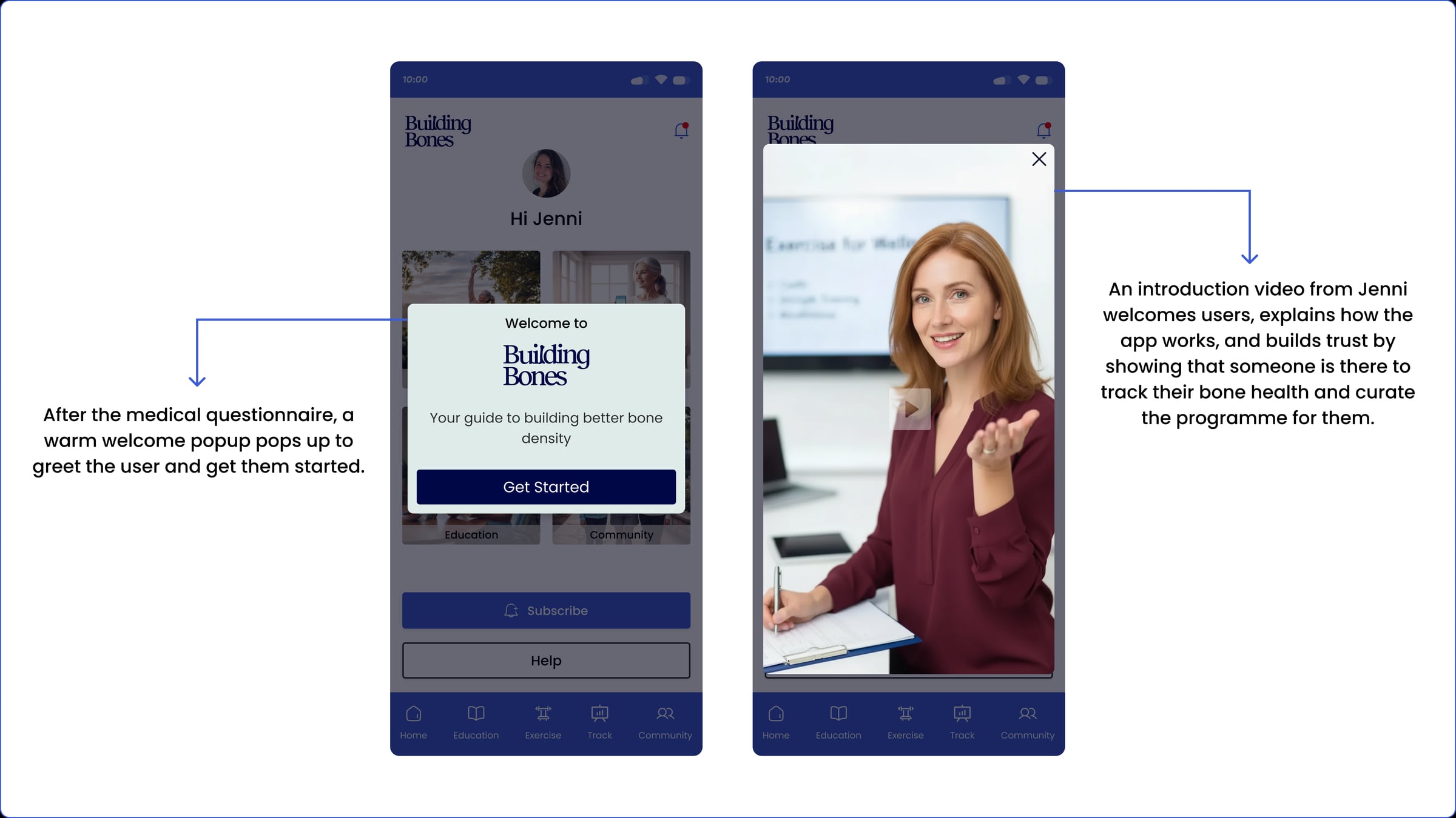
Then comes the welcome. Jenni introduces herself personally — a real physiotherapist, and why she built this — so the first face you meet isn't a brand, it's a person who's clearly on your side. By the time you reach your programme, the app has already earned a little faith.
The medical questionnaire — 24 steps, one at a time · click the video to pause and read
06
The home screen
One calm hub — and you can reach anything from here.
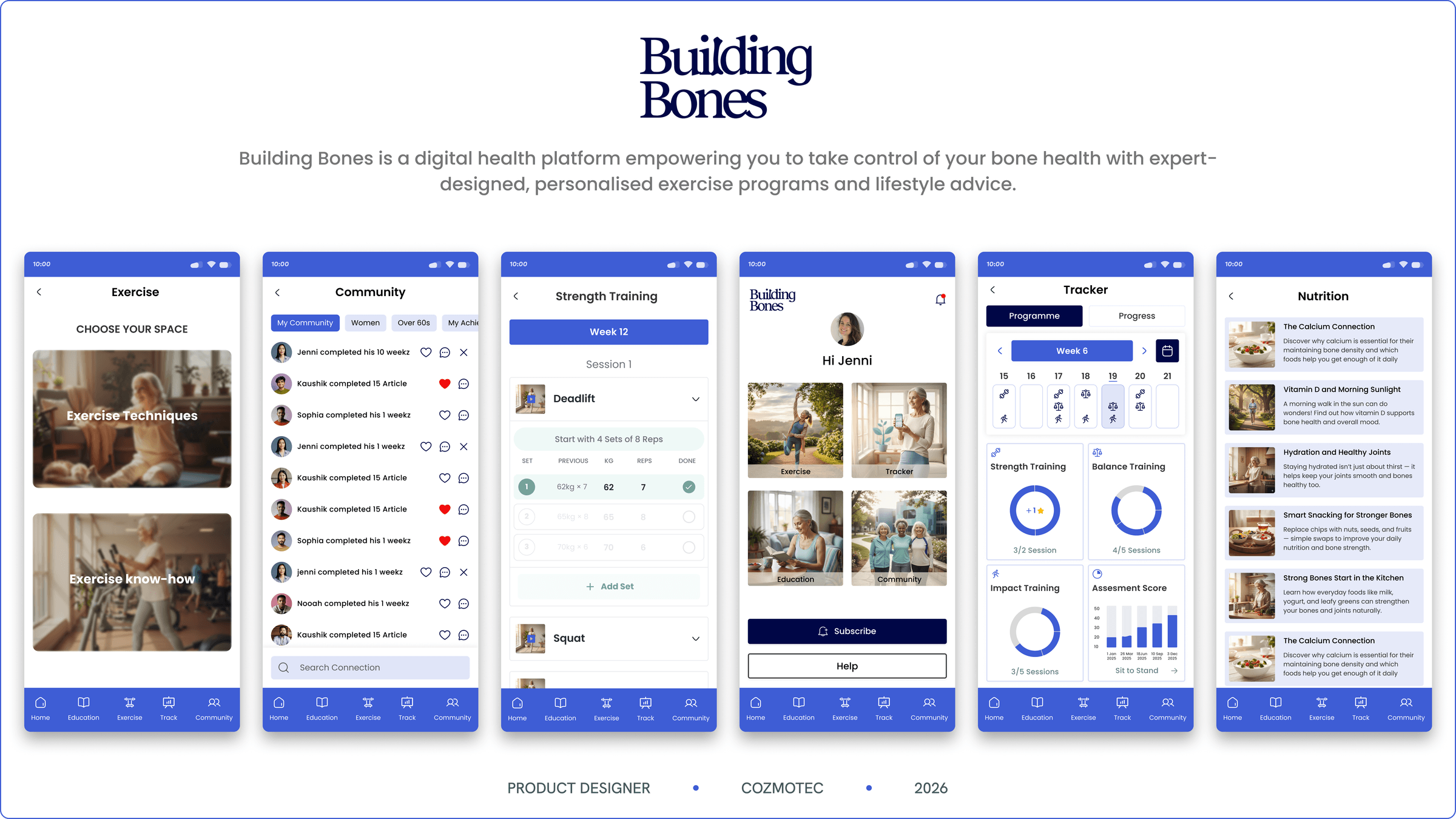
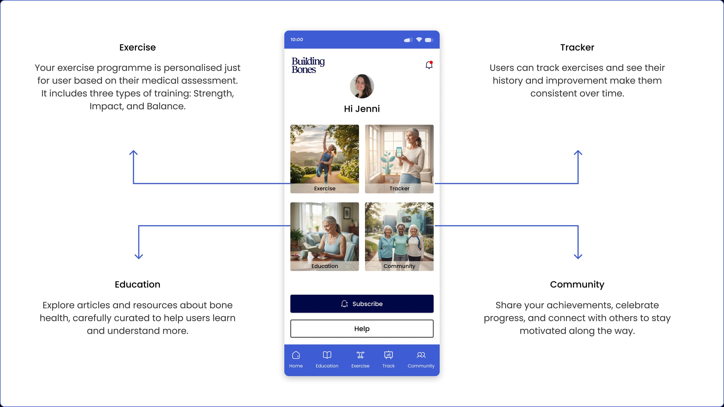
After onboarding, everything lives behind a calm home screen. Four clear ways in — Education, Exercise, Tracker and Community — each a large, obvious target, plus a persistent bottom bar so those four are always one tap away, from anywhere in the app.
That's the whole navigation idea: never make an older user hunt, or wonder where they are. Larger type than a typical app, one primary action per screen, plain labels, generous tap targets. The depth is all there underneath — programmes, lessons, history — but the surface stays simple enough that you can't get lost.
07
Exercise
A 12-week programme, three kinds of training, one physio on video.
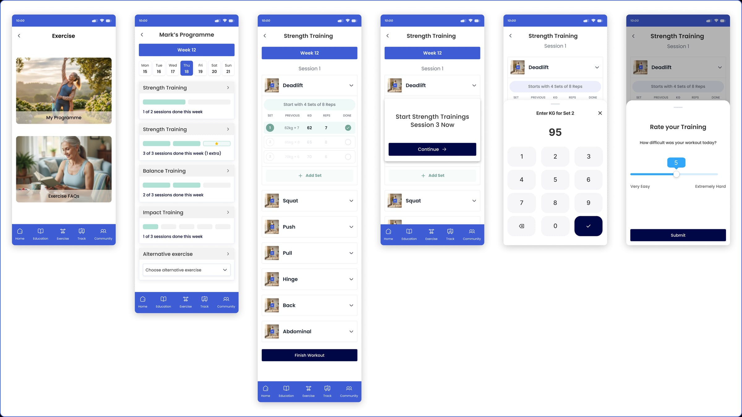
Bone health isn't one thing, so the exercise is built on three evidence-based pillars: Strength (builds bone), Balance (prevents the falls that cause fractures), and Impact (stimulates new bone).
It runs as a 12-week programme, and every week has a clear shape: two Strength sessions, three Balance and three Impact. The user just opens the app and follows their week — each session guided step by step, reps and weight logged as they go. On a good day they can add an extra session and log that too; the programme counts the effort rather than ignoring it.
The harder problem was trust: why follow exercises from an app at all? So every exercise is demonstrated on video by Jenni herself, the physiotherapist behind the platform — turning "an app told me to" into "my physio showed me how." And everything a user does here flows straight into the tracker.
08
Education
Answers, from someone actually qualified to give them.
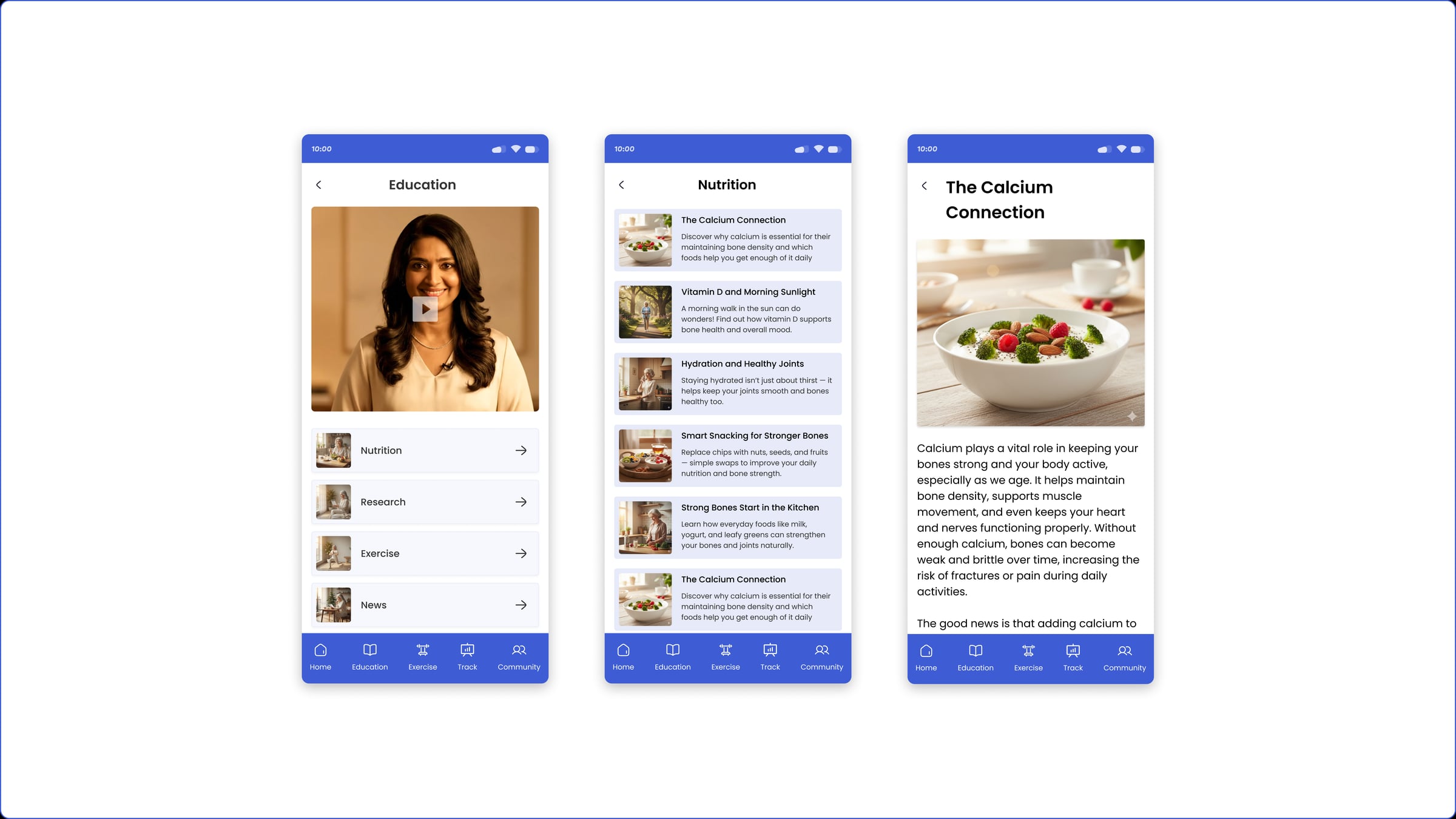
Alongside the exercise sits a growing library of education — plain-English lessons on osteoporosis, nutrition, and the everyday habits that protect bone. It's the "why" behind the programme: understand what's happening in your body and you're far more likely to keep going.
All of it is written and published by the physiotherapist through the admin, so what a user reads is clinically sound — not generic wellness content pulled off the internet. Trustworthy advice in one place was half the original problem; this is the part that answers it.
09
The tracker
The whole programme, turned into one calm picture.
This is where I spent the most time. The tracker has to mirror the entire programme — every Strength, Balance and Impact session across the twelve weeks — and still be readable at a glance for someone in their seventies.
So it reads at two speeds. A week view shows the current plan; a month view zooms out, and each day carries a small icon for the training done that day — a whole month reads as a picture, not a wall of data. A day with an extra session is flagged with a +, so going beyond the plan is celebrated, not lost. And progress stays plain — a Total Adherence figure and a percentage ring per training type across the twelve weeks, not charts you have to decode.
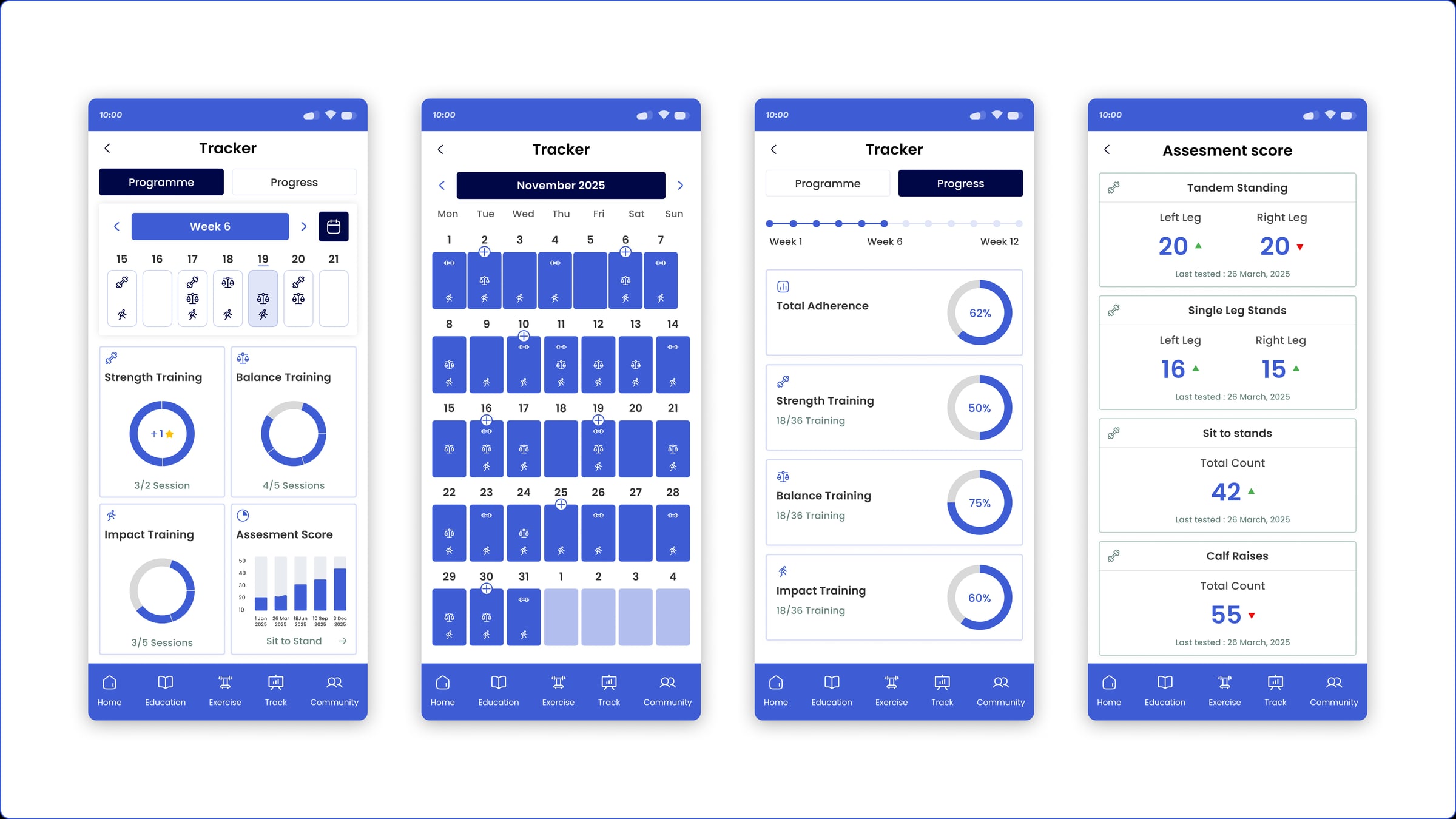
And the Assessment Score is its own thing — not the medical questionnaire from onboarding, but a set of real physiotherapy tests: Tandem Standing, Single-Leg Stands, Sit-to-Stands and Calf Raises, scored per left and right leg and re-taken over time. It's progress measured the way a physio would measure it — proof the training is genuinely working, not just a streak.
10
Community
Progress is easier when you're not doing it alone.
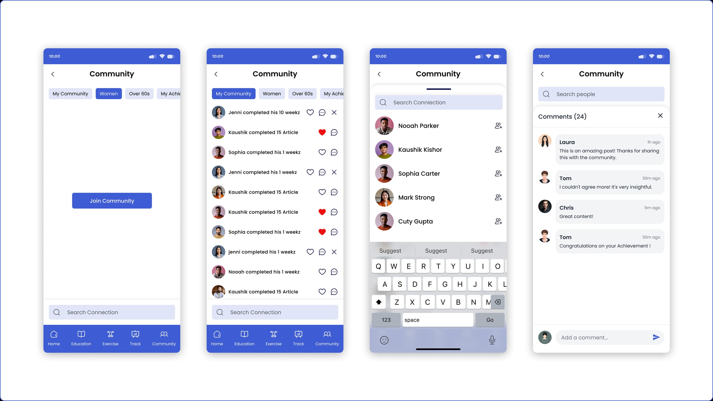
Keeping anything up for twelve weeks is hard by yourself. The optional community lets users share milestones and cheer each other on — a light way to feel part of something, and a gentle nudge to come back tomorrow.
It's deliberately calm: no pressure, no comparison, no numbers to feel bad about. Just quiet encouragement from people on the same journey — which, for actually sticking with it, does more than another reminder ever could.
11
Profile
Where the plan stays current as the person changes.
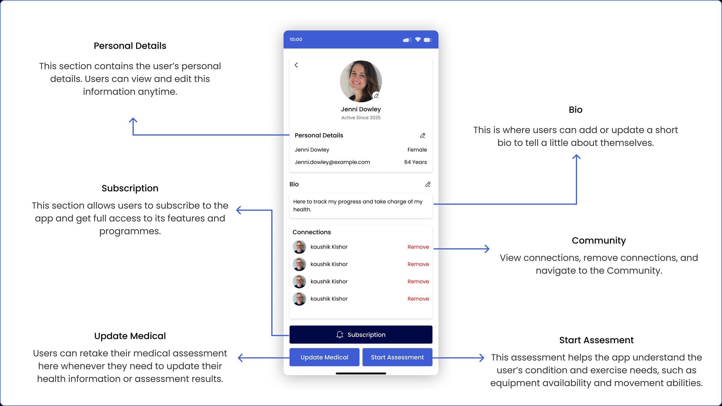
The profile holds the everyday things — personal details, a short bio, community connections, and the subscription that unlocks the full programme. All editable, all in plain sight.
But the part that matters is two buttons: Update Medical and Start Assessment. This is where both assessments live and can be re-taken — the medical questionnaire when health details change, and the physical assessment (equipment, movement ability, the balance and strength tests) as someone gets stronger. Re-take either and the programme adjusts with them, so it never stalls at day-one difficulty.
A quiet screen doing an important job: keeping the plan a user follows in month three honest to the person they've actually become.
12
The admin side
Made to fit — every plan starts auto-generated, then the physio tailors it, exercise by exercise.
A new user's programme starts auto-generated from their medical questionnaire — a safe starting template, not a blank page. From there the physiotherapist opens that user's profile and can edit or add exercises to each type — Strength, Balance and Impact — tailoring the plan to the person. That's why there's no separate "builder": the tailoring lives right inside the user's current programme.
Those exercises come from a CMS the physio also runs: the exercise library (each with Jenni's video) and the education content that feed the whole app. Build the library once, and it powers every user's plan.
The same profile shows a user's current and previous programmes, what they've actually completed, their assessment answers, and private notes only other admins can see — so the physio always has the full picture. Automated where it helps, human where it matters, and designing both sides of that is the part I enjoy most.
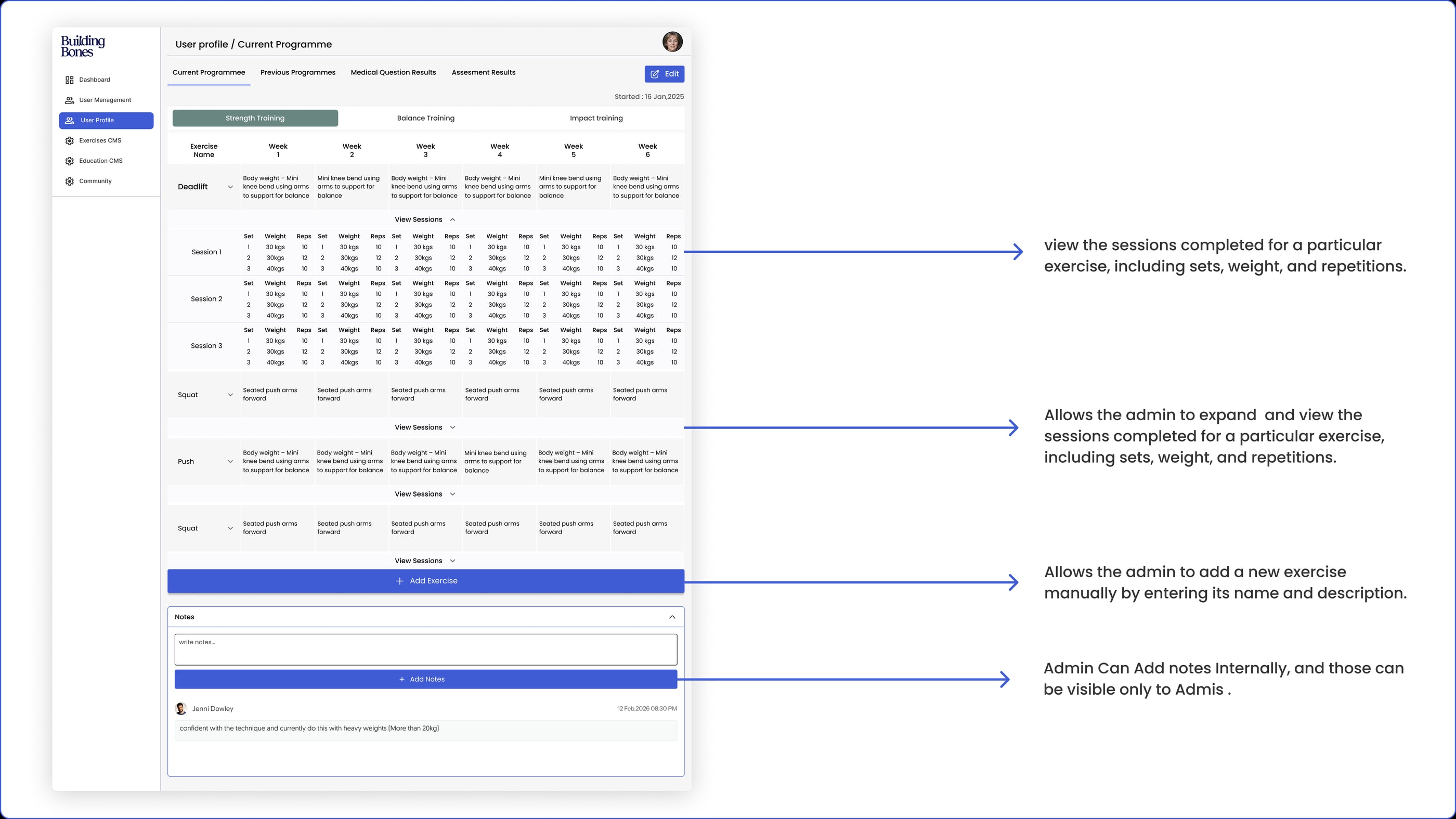
The admin's user profile — where the physio tailors a programme · tap to open full size ↗
13
Where it landed
The design is complete — the app and the physiotherapist's admin behind it, both taken end to end and handed over. It's in development now, with parts of the backend still being built out, and the app is already in front of real users.
14
Reflection
Designing for older adults changed how I work. Every assumption about what's "obvious" gets tested when your user is seventy and genuinely afraid of falling — you design slower, simpler, and with far more care about trust.
The win here was restraint: taking a real clinical system — a 23-step intake, three training pillars, physiotherapy assessments, a two-sided CMS — and making it feel calm and safe enough that someone would actually open it every week. That's the work I want more of: hard, human systems, made simple.